BLOG

Archive for the ‘Design and Colour Ideas’ Category

Paint to Help Sell Your Home

Posted on:

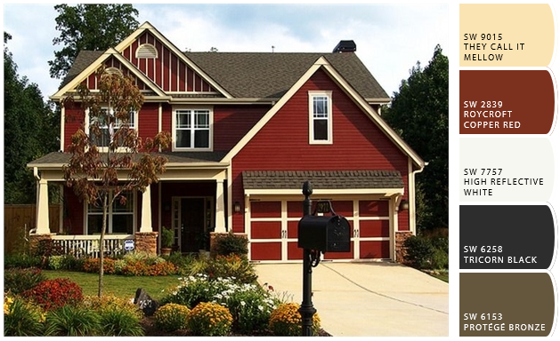
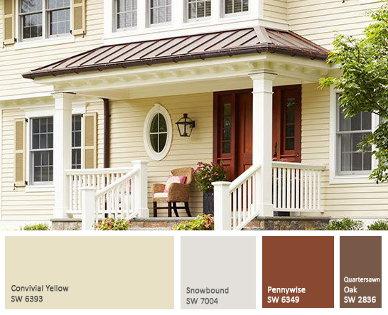
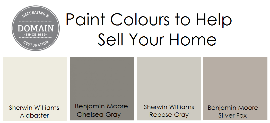
Paint Colours to Help Sell Your Home

With Spring fast approaching many of us are thinking about Spring cleaning and sprucing up our homes. Spring also means that many people are thinking it may be time to sell their home and painting is a great way to help prepare and maybe even sell quicker. There are so many options but today we are going to touch on paint to help sell your home.

Prospective buyers are often influenced my the way a home feels when they walk in or tour the rooms. We all know that you are supposed to look at the potential that a space has when looking to buy but subconsciously esthetics play a large role in many peoples decisions. Lets be honest first impressions are everything when looking to sell your home.

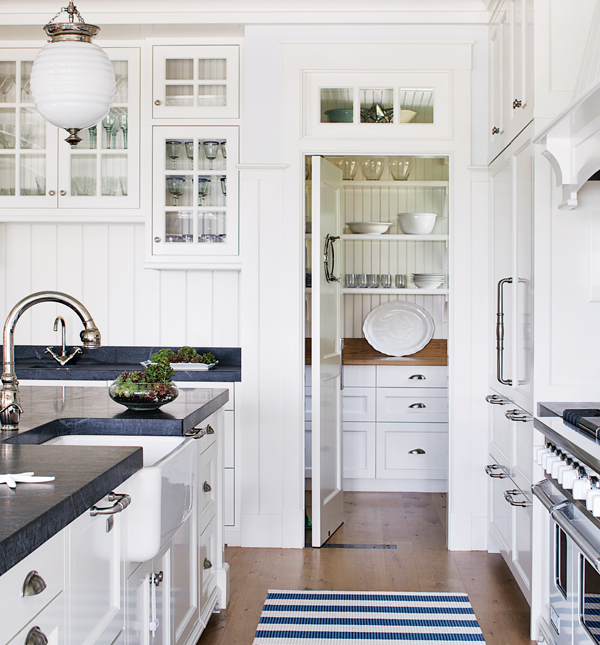
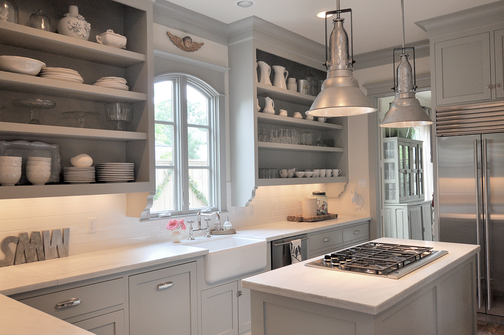
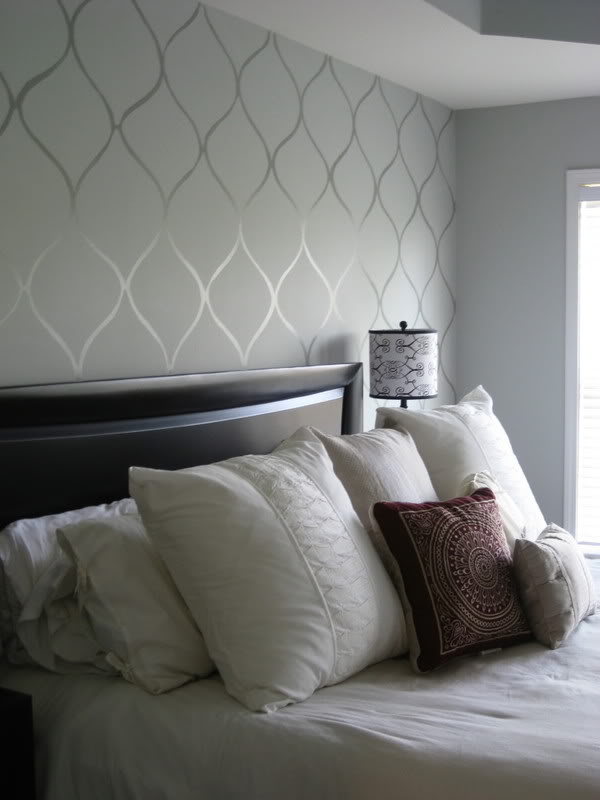
In general you should think about using neutral colours to make your space a canvas that buyers can work from when thinking about décor and how their belongings will fit into the home. Now we know that when people hear neutral they think of the lackluster whites and beige, but that’s not true. There are so many colour options that can become overwhelming but that why we are here to help.

Sherwin Williams – Alabaster

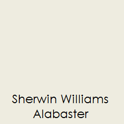
Alabaster is a white tone that was one of Sherwin Williams Colours of the Year for 2016.  This neutral is a great base colour to use when preparing your home to sell.  There is no blue undertones and it provides a warm and inviting feel. It pairs well with many other colours that can act as an accent in your space.


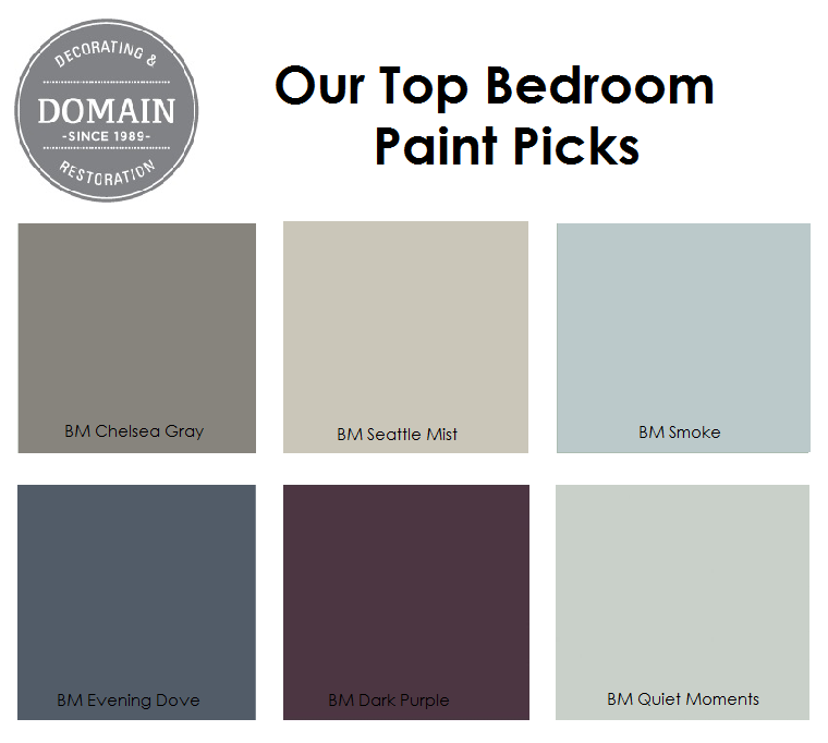
Benjamin Moore – Chelsea Gray


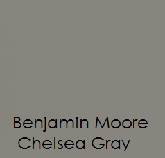
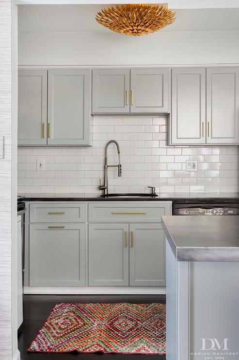
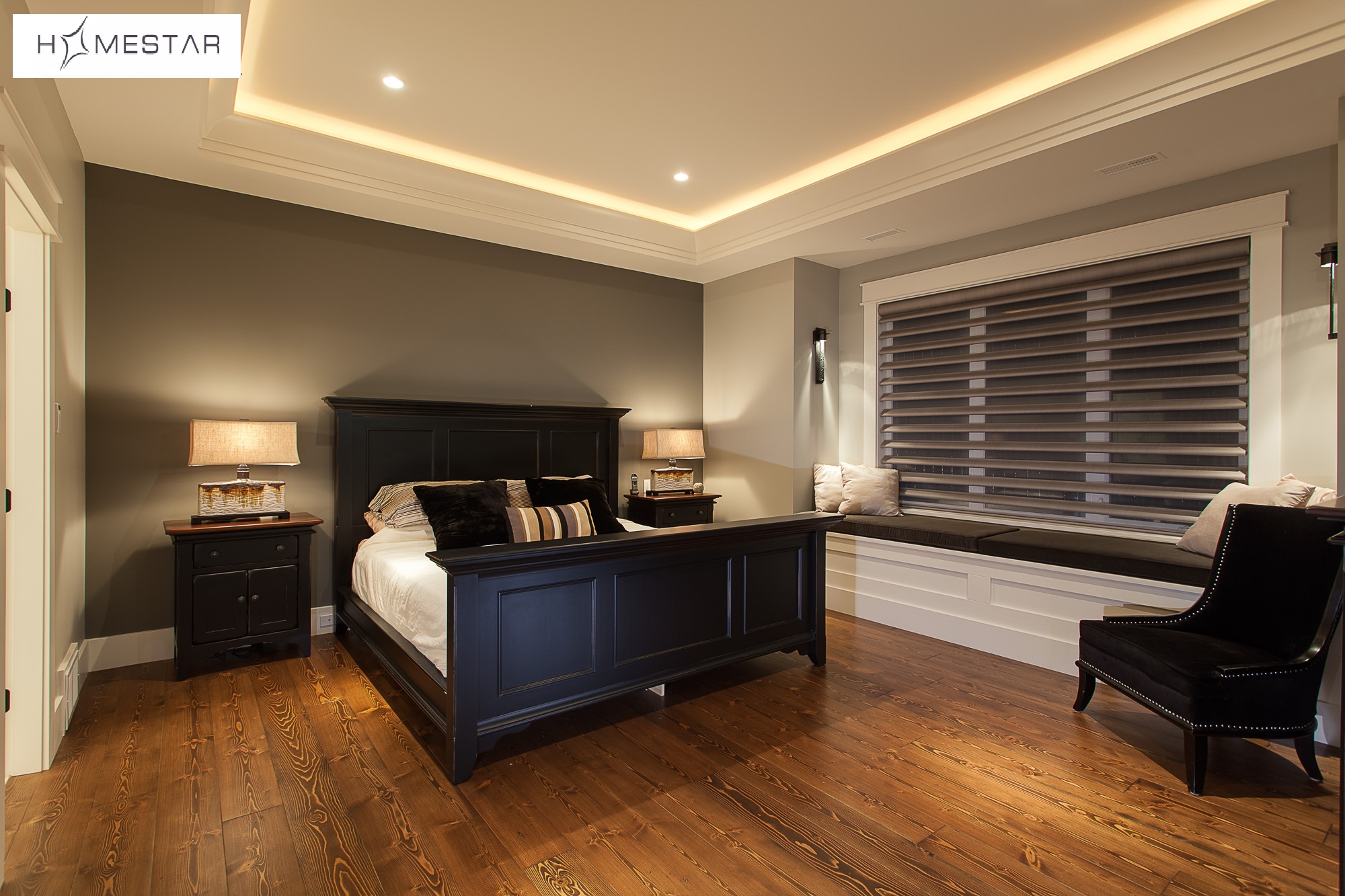
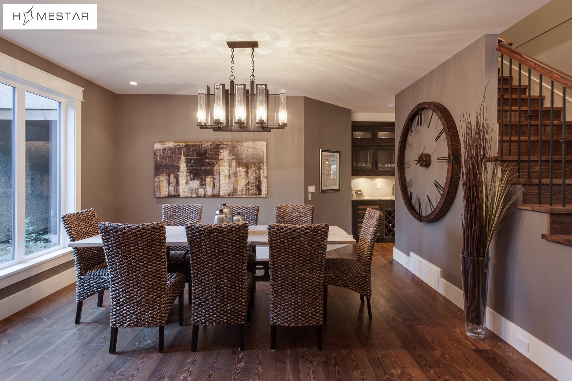
Chelsea Gray is the boldest of our colour picks.  We like this colour because it is versatile and pairs well with other greige tones that have been the rage in the last few years.  This Gray is bold and provides depth to any space.  It can be used as an accent wall colour or a whole room colour scheme if you aren’t afraid to be bold.


Sherwin Williams – Repose Gray


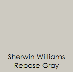
If you are looking for a soft gray with a beige or taupe undertone repose gray is a great choice.  It falls in the middle of the warmth spectrum not being warm but not cold.


Benjamin Moore – Silver Fox


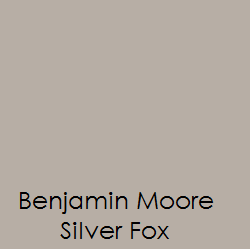
Silver fox is another great colour.  It isn’t silver as the name may make you think. It is more of a gray beige that gives you that warm and cozy feel that everyone is looking for. This colour is a great pick if you looking to warm up your space.


Bedroom Paint Picks

Posted on:

. A Bedroom should be your oasis. A place where you go to rest and relax after a long day of work or running around with the kids. There are so many different ways to make your space warm and inviting but today we thought we’d touch on our top bedroom paint picks.

Bedroom Paint Picks

Domain Decorating’s Bedroom Paint Picks

Chelsea Gray by Benjamin Moore is a great choice for a bedroom. It is a dark neutral that can be paired with many different accents and looks great with white trim and mouldings. This dark neutral can be very inviting and warm.


BM Chelsea Gray

BM Chelsea Gray

Image from Décor Pad

Benjamin Moore’s Smoke is another great choice for a bedroom. It brings a simple elegance making if one of our favourites on our top bedroom picks list. Paired with a white or silver a beautiful statement can be made.

BM Smoke

BM Smoke

Image from Homebunch

If you are looking for something more contemporary we like Benjamin Moore’s Evening Dove. This dark blue gives a crisp clean look and looks great with a variety of different accent colours.

BM Evening Dove

BM Evening Dove

Image from Deloreme Designs

Tranquility is how Benjamin Moore describes our next bedroom paint pick. Quiet Moments is said to inspire quiet meditation and is a great colour selection if you’re looking to create an elegant soothing space.

BM Cool Moments

BM Cool Moments

Image from Laura Trevy

Dark Purple is a very glamourous colour. We love this for a master suite. Its dark tone provides a great sense of warmth especially for those cold winter nights.

BM Dark Purple

BM Dark Purple

Image from Kylie M Interiors

No matter your style or colour preference the options are endless.  Here at Domain Decorating we are here to help your vision come to life.  We offer one on one service to help you select the perfect colour for your space.  Contact us today for a free quote.

For more design ideas or colour tips follow up on Instagram or like us on Facebook.


Cabinetry Paint Colours.

Posted on:


Painted cabinetry has become very popular when renovating or updating homes.  We have compiled a list our favourite cabinetry paint colours with many different options depending on your individual preference.

CabinetryPaint Colours

Cabinetry Favourites

Choosing a basic white can be a very daunting task as there are so many shades and undertones to choose from.  Two of our favourite whites are Sherwin Williams Pure White and Benjamin Moores Decorators White. Pure White is softer with more of a beige undertone whereas Decorators White is more contemporary.

CabinetryPaint Colours

Sherwin Williams Pure White

Photo From Linda McDougald Design

CabinetryPaint Colours

Benjamin Moore Decorators White

Photo From Boston Magazine

The use of the grey and beige has also transitioned into painted cabinetry selections with two of our favourites being Benjamin Moores Field Stone and Coventry Grey.  Field stone is more of a warm beige grey whereas Coventry Grey has a cooler colour base but both look great when accented with whites and stainless fixtures.

CabinetryPaint Colours

Benjamin Moore Field Stone

Photo From Cote de Texas

CabinetryPaint Colours

Benjamin Moore Coventry Grey

Photo From Design Manifest

If you are looking for something darker or more rich in colour, we suggest Benjamin Moores Hale Navy or Deep Silver.  Navy has been making a comeback in décor and home updates and its a great colour choice.  If your not sure try painting a bathroom vanity or just your island this colour it looks great as a statement or accent colour.

CabinetryPaint Colours

Benjamin Moore Hale Navy

Photo From Sealy Design

CabinetryPaint Colours

Benjamin Moore Deep Silver

Photo From Gerry Smith Architect

There are so many different cabinetry paint colours available but these are just a few that we’ve chosen to highlight.

2016 Exterior Home Colour Picks

Posted on:

There is some beautiful weather out there and it appears that spring has arrived. This means that exterior painting season is upon us. We already have a list of homes waiting on us and more requests are flooding in daily which is great!

Since we’re already getting into the swing of things we’ve done some sourcing to find some great colour combinations and trends for this year that are sure to impress. Here are our 2016 Exterior Home Colour Picks.


Beige

Here is a simple yet classic beige exterior. Theses colour combinations are timeless and make a great choice for many different styles of homes. This photo is from www.vissbiz.com. Colour selections from Sherwin Williams “Color Snap”

grey

If you are looking for something more crisp and modern a great grey and white combination is a good choice. The image we have here pairs grey with pops of red and navy blue which are on trend for this year. Image from www.colorworldhousepainting.com

navy

Navy blue is always a classic option. Paired with a crisp white the contrasting accents are a great feature. This photo is from www.11magnolialane.com. Colour selections from Sherwin Williams “Color Snap”

red

Red and creamy yellow or even a soft white are another beautiful combination if you are looking to make a statement on a classically styled home. Colour selections from Sherwin Williams “Color Snap”

yellow

Yellow is a way to brighten up your home. It has been making a comeback in the past few years making it another top contender for traditionally styled homes. Image from www.colorworldhousepainting.com


No matter your preference, now is the time to start thinking about the exterior of your home. You can start prepping and getting ready for paint which will make the process go much more smoothly. Stay tuned for our next blog about how to ready the exterior of your home for paint.

If you have any questions don’t hesitate to contact us we’d be happy to help or provide you a free quote.

Adding Warmth With Wood.

Posted on:

Adding wood elements to your home is a great way to add warmth.  Solid wood accents can be added with mantels, railings, beams and even ceilings.  There are so many ways to bring the warmth of wood indoors into your home to create a beautiful and inviting space for your family.

Today we thought that we’d share some wood elements from homes that we’ve recently worked on.  These are some great examples of adding warmth with wood.

Homestar Designs

Here is a home we completed with Homestar Designs. You can see the beautifully stained wood mantel, beams and ceiling. This room is very warm and the presence of wood brings a classic elegance.

Gallery Homes

This is a kitchen in a home that we completed with Gallery Homes. You can see here that the beams are accented by using a different colour on the wood ceilings. As well, the windows are cased with stained wood versus painted mouldings. These wood accents add a country feel to a classic space.

Homestar Designs

Here is an open concept kitchen with a country feel. The simple white walls and cabinetry are beautifully complimented by the two different tones of wood on the ceilings and beams. This wood ceiling opens up the space more that a solid painted ceiling would. This home was completed by Homestar Designs.

Homestar Designs

Here you can see some wood brought into the space with the dark stained door and trim as well as the stairs and railings. This is another home we worked on with Homestar Designs.

The options are endless if you are thinking of adding wood to the interior of your home.  There are so many ways to update your space using wood or refinishing your wood surface.

Our team at Domain Decorating are here to help you with all your wood needs so please don’t hesitate to contact with any questions of for a free estimate on your upcoming project.

Accent Wall Ideas

Posted on: 8 Comments

Accent walls are an easy way to add colour or visual intrigue to a room without over powering the space. They allow you to experiment with bold colours and textures.

An accent wall can be used to highlight an architectural feature, define a space in an open concept plan, create a focal point in a room at a fireplace or shelf, and can be used to highlight a piece of artwork.  When you walk into a room the accent wall will command the eye and bring your attention to that space.

We suggest picking an accent colour from fabrics or art pieces in the room. You can choose your favourite colour from a throw pillow or art print. You can also choose a colour that will help transition from one space to the next in your home. An accent wall can be used as a way to create flow between different rooms and colour palates used in each.

Here are some different accent wall ideas that we’ve put together .

Solid Colours

media_room_2009

Vibrant colours will make a bold statement, whereas darker colours will create a more dramatic and mature effect. If you are looking for something more subtle you can use a deeper shade of the colour used in the rest of the space. This will break up the space without drawing as much attention. {photo from Beyond Clutter Designs}

Wallpaper

Homestar - High Point Lot 37 (2)

Wallpaper will allow you to add more texture and print into a space. There are many different choices and you are sure to find something that will suite your home.

Colour Blocking

You can add an accent wall using colour blocking or multiple colours. You could add a striped wall or try something more geometric like a chevron pattern. Depending on the style of your home there are many different ways you can accent a wall with multiple colours or shades.

Faux Wallpaper

faux

Many people have accented a wall using a stencil and a combination of different paint sheens making a faux wallpaper appearance that is subtle but also has quite the impact. {photo found on kfdesigns.com}

Stone or Tile Accents

IMG_6000

A stone accent wall is a beautiful and sophisticated choice. It’s hard to go wrong when adding natural materials to indoor décor.


Whichever you choose, an accent wall will make a space more inviting and is a great way to change the appearance of a space without painting the whole room.


For more information or tips like us on Facebook or contact us to request a free quote for your home.

Gray is the New Neutral – Choosing the Right Gray for Your Home

Posted on: 2 Comments

Move over beige, gray is taking over as the new “It” colour. Gray has become a very popular neutral colour to use in many homes. With its many different undertones and shades you are sure to find the right colour for your space. There are so many different options though, and many of my clients ask me where to begin when trying to select the right color. Because there are so many options I’ve compiled tips for choosing the right gray for your home.

Gray has so many undertones so it is import to know the feel you are looking for in your space.

Light grays in a well-lit space will give you luminous silver looking paint that can be very elegant and enticing to the eye.

A very pale light gray is a great selection if you want the classic clean feel of white with a little warmth.

Charcoal and dark grays are very calming and are often the colour of choice in a bedroom. Charcoal can be very elegant if used with the right accessories.

Homestar Designs

If you’re looking for something a little more laid back and casual why not try a gray with a purple undertone.

If you’re looking for warmth and are still hesitant to embrace gray at its fullest try greige a gray and beige combination. You could also look at something with warm earthy undertones. These are great for gathering spaces in your home like kitchens and family rooms.

Homestar Designs

If the modern cool steel look is what you’re going for select a gray that has a blue or green undertone.

Gray is best when paired with high contrasting colours like white and or yellow. A white trim against a gray wall adds a very clean touch to a space. Pair it with some yellow accent pillows and accessories and you’ve got a beautiful modern space.

Homestar Designs

Remember to allow your other pieces or current colour schemes to guide you through the process of picking the right colour. If you’re keeping some staple pieces you want to make sure the gray you pick is going to complement then and make your space look its best.

There are so many options out there so take the time and think about what it is that you’re looking to gain from a space. If you’re still confused we are here to help and can provide you some ideas or show you some sample colours. At Domain Decorating we are here to guide you through the painting process beginning to end.   For more information feel free to contact us, we are always here to help.